INterview

Interview with Michiel Wijnen for Danone

The new global headquarters for Danone in Dutch Hoofddorp was inspired by the company's vision of the connection between people’s health and the environment. Architect Michiel Wijnen collaborated with architect studio DZAP to create a top modern space with a WELL gold & LEED gold certification.

For Bolon, Wijnen describes the process and challenges, how to express a company’s values in interior architecture while keeping a tight schedule.

– I was asked by DZAP as external lead interior architect for this project. We both have a different way of working. I’m used to think/create from an experience, from a hospitality viewpoint. To create a clear concept before starting with the actual design. DZAP has a lot of know-how and experience from a building perspective, as it is a Design & Build company. They are service minded. This way we complemented each other in this project. I think that it worked out fine, with a beautiful result and a happy client.


What was your vision when accepting this project?

– The vision I had in mind when we started the project was to create a Campus of Confidence. A new Danone global headquarters as a campus reflecting an international character. A campus as an immersive and intuitive workspace, providing all necessary utilities, tools and communication. A place of optimism, building a better future, starting with oneself. A place of communication , exchange of information. A place which is bustling, living, convincing, a community you want to belong to, giving you hope, learning, teaching, breathing the Danone personality. Something like that.

What was the biggest challenge?

– Time. There is always a tension between the interests of the building contractors and the interior contractors. In the end it is our responsibility to keep the starting points alive/upright. But there is also a deadline, 800 people have to get to work. A good cooperation between all parties is important.

How was the issue of time tackled?

– To make clear choices, stick to the essence. First make sure there is a good basis. Some things can be added later on. For instance, we have just started a second phase. A second layer to further implement Danone specific storytelling and messaging.

When designing a commercial project of this scale, what are the key things to consider?

– It is important to empathize with the client. What is their message? What do they want to propagate? Sometimes you have to challenge them a bit. I find it is important to think from the identity of a company, from their DNA. Danone is an ambitious company. They want to make a positive contribution for a better world, a better climate. Therefore we had some clear and ambitious challenges. For instance the WELL Building Standard. Focusing on human well-being in a broad sense. It sets preconditions for use of material, light, acoustics, air quality but also regarding nourishment, fitness and cognitive and emotional health.

In an interior project everything comes together, multiple disciplines, multiple preconditions. Selected materials for example have to have a certain look and feel, but on the other hand it is also important that they are durable and easy to clean.

Last but not least is the fact that this is one of the three global headquarters, next to Paris and Singapore. Starting point was to give the headquarters international allure. A strong, timeless, base.
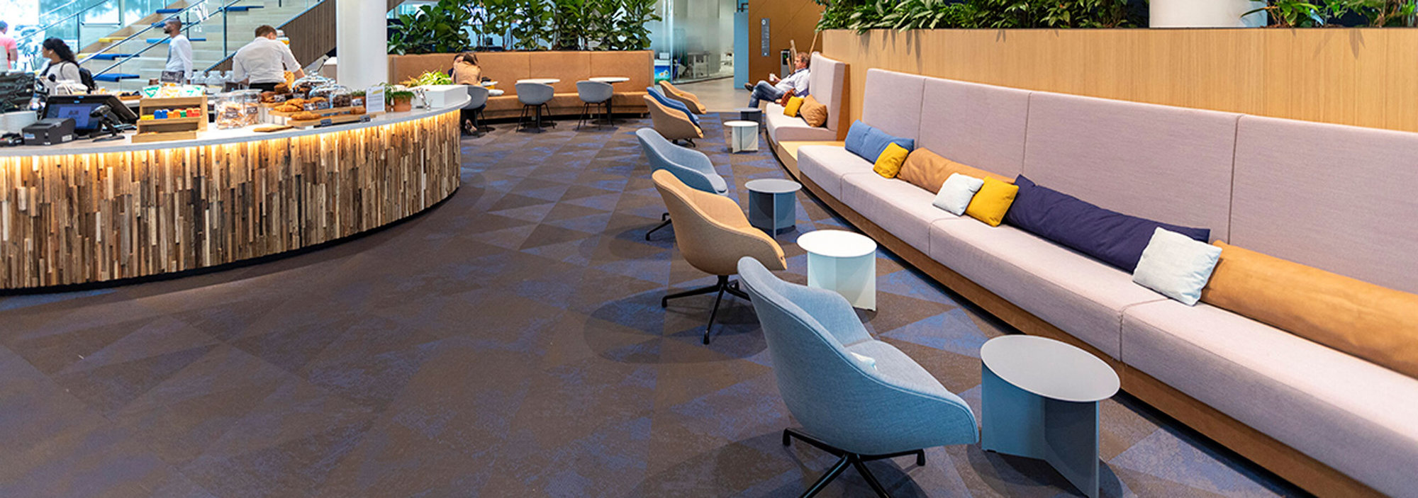
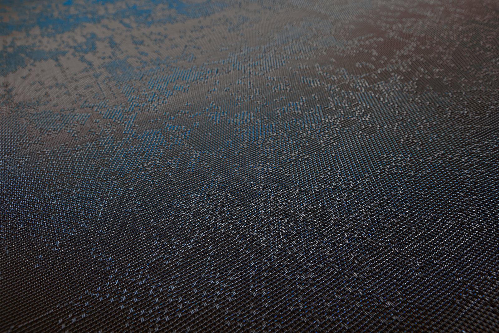
What were the reasons for choosing our Studio Triangle from the collection Create in the color Fabrico?

– I wanted to create a significant different feel for the hospitality areas, like the central bar area on the ground floor. These are the more inspirational and social meeting areas. As opposed to the more dynamic and efficient traffic areas surrounding them. Most used flooring, a light oak loose lay vinyl, is beautiful but has a fairly plain structure/tactility. I wanted to create a clear contrast between the different floors, not only in colour, but precisely also in structure and tactility. I have used Bolon more often so I’m familiar with its specific qualities. We have had some discussions mostly regarding cleaning. Facilities dept. are always a little anxious because of the relief of the Bolon flooring. In the end we have been able to convince them...

The beautiful thing of the Fabrico color is the blue thread. It is a binding element for the interior. The blue represents Danone and the amount of blue is dynamic because it is depending on the angle in which you look at the floor. This is an added value and in the end the client is really happy with the choice we have made.     

Related stories