Intervju

Speaking of colour – Tekla Severin

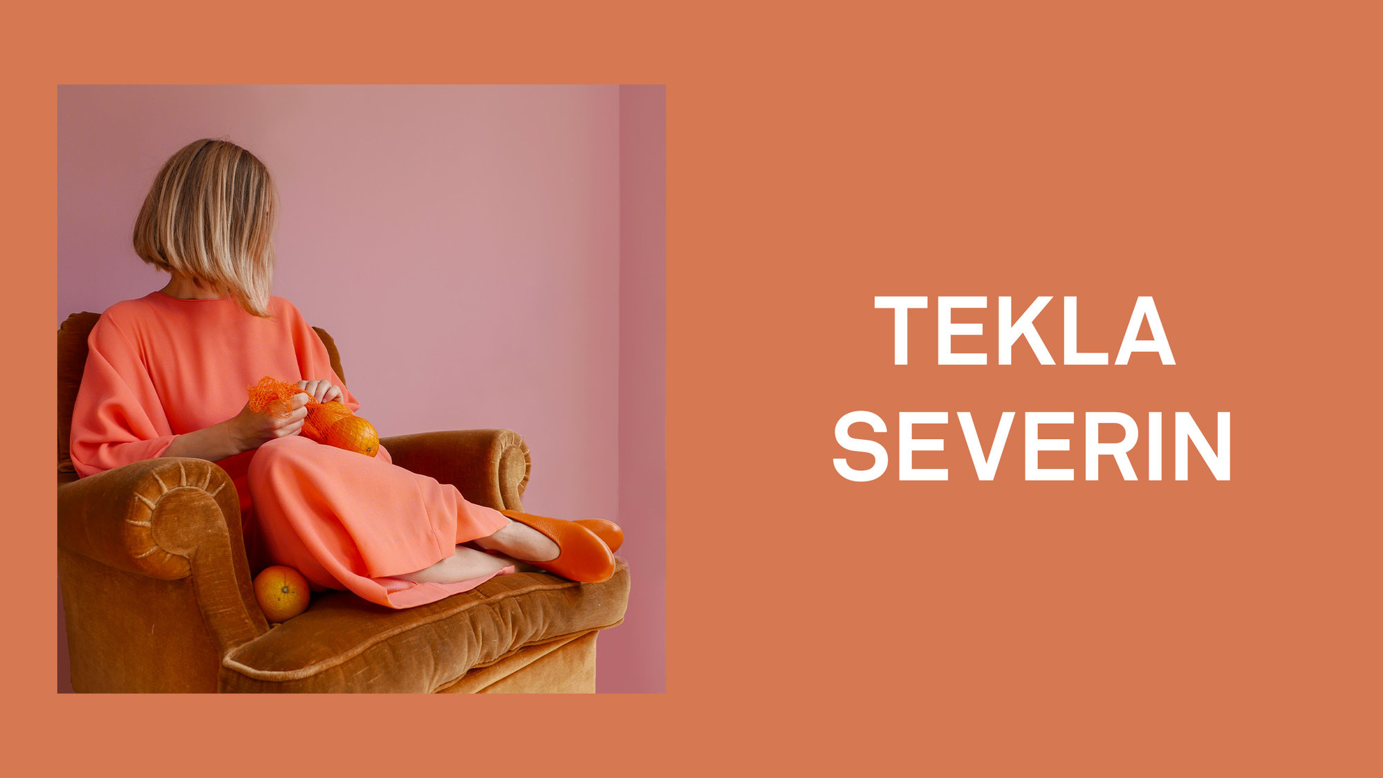
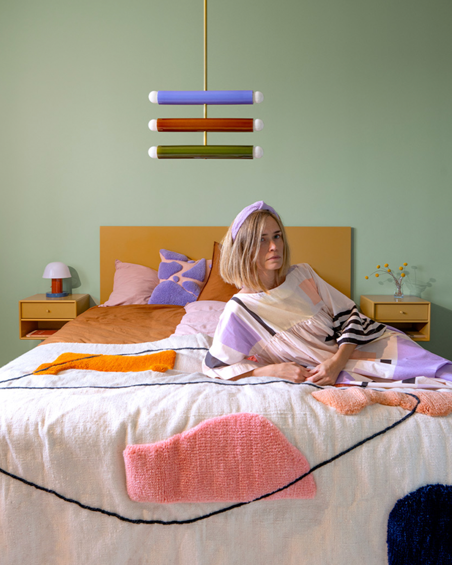
If you mention Tekla Severin to someone within the design community it immediately conjures images of squares, circles and arches. Her images include a multitude of colours and, what should be considered her trademark, herself. Halfway out the door, hair covering the face or peeking from somewhere in the background. Tekla is, undoubtedly, one of the most influential people when it comes to colour and design.

Her confidence with colour has led to collaborations with brands such as Montana, Muuto, Tylko and Heymat, to mention a few. In 2022 she was named Kitchen Design of the Year at the Elle Deco International Design Awards.

We asked her about how she started, how she navigated a career in something as subjective as colour and, of course, what her favourite colour is. 

You call yourself a “colourist” – what is that?

- A colourist can be defined, as all concepts, in many different ways. A painter who uses colour itself as a subject of a painting or as a hairdresser that´s dyeing hair.

I use the concept colourist to describe what I basically do; I work with colour as the main subject and focus in all my projects; no matter which role I play. As a set designer, interior architect, product designer, creative director or as a photographer. I´m not a fan of long pretentious titles but I haven’t found a better way of describing myself shortly, than a colourist, multidisciplinary designer and a photographer. But if I had to describe myself as only one thing it would be as a colourist.

When did you start working professionally with colour and why?

- I did start to work professionally with colour as an employed interior architect after graduating Konstfack in interior architecture and furniture design, doing both public and residential projects.

But I pretty soon felt the common Scandinavian style with all its whites, beiges and grey´s and its conformity, was too narrow minded for me. I was craving something else. Something more expressive and direct! At the architecture office where I worked back then, we had this amazing material library with all kinds of colours and textures. I started to create small visual colourful notes, like mood boards or still lifes, for myself, capture them with a very early smartphone and then using “that new app” called Instagram to create a gallery for myself -  was the initial purpose. This was 2012 and somehow someone found my “notes” and my first commission was doing colourful content for a Canadian shoe company. Then I took babysteps working less and less at the architect office before going full freelance, starting my own studio in 2015.

The first years I worked mainly with colour as a set designer and photographer. I found it very liberating to work so focused, directly, fast and hands on with colours, shapes and compositions - not having to consider function or premises as when I worked with architecture.

Recent years I have come back to work with interiors in many different ways as product/furnishings designer and doing different “Teklan colour editions”. A highlight so far was definitely “an apartment of one's own” the interior/exhibition design I created for Spanish Sancal for this year's design week in Milan.
I´m back to interiors, and I work with it as deconstructed and colourful as I want. The circle is complete.


I never build strategies or set up business goals but I'm lucky enough that what interests me, so far, seems to interest others.

TEKLA SEVERIN

You are, undoubtedly, one of the most influential people when it comes to colour and design. How does one navigate a career in something as subjective as colour? And how do you reinvent yourself?

-  I continue to work the way it all started. Today I am still driven by “where the energy is”. I never build strategies or set up business goals but I'm lucky enough that what interests me, so far, seems to interest others.

Since colour is always relative and never absolute (it is what you put next to it that defines it) I find it an endless world to discover. New combinations or, as I usually call them, dialogues. It will never end. And of course the more I do, the more I study, how the years pass by, the times we live in changes, depending on “trends”, what kind of commission I do, plays a part in evolving colour dialogues even further.

How would you go about decorating a room with coloured floors?

I would go all colourful, needless to say! But as in all projects it all depends on the premises and context. How does the room look, is it big or small, what´s the age of the building, who or whom are going to use it, for what function, which style of furnishings, how´s the lighting, daylight?

I've done coloured floors for many years now and the colour approach I have chosen have either been monochrome colours, tone-on-tone or colour blocking. But I’m looking forward to working more with decorated floors.

How should we approach colour in our daily life i.e. clothes and interior? And what are the potential benefits?

I never want to tell anyone else what to do. I´m an individualist and a very non dominant person. But “colour is light, light is energy and energy is life” as someone once said, and who doesn't want to say yes to that in their life?

For city planning, housing etc I think it's another matter. We all have a responsibility to create a ground for good living and society.

Colour, craft and care about the details have been rationalised a lot in the last decades of city planning, housing and building. That has created an atmosphere that’s quite inhumane. However, during the pandemic I believe many people have questioned how they live, and more importantly how they want to live and, hopefully, we will change this status quo.  At least I can see a trend for more colour and pattern is coming, even in Scandinavia!

Are there any colours to avoid and why?

I think there are definitely colours to avoid in certain contexts and cultural contexts. It’s a language that can definitely be used wrong, in different interiors, institutions, politics, brands and so on. It is all about what one wants to communicate. Personally I’d like to say that I never dismiss colours, it's all about the context and combination. Colour is always relative!

What is your favourite colour?

It changes all the time, and is always depending how and where. But an all time personal favourite is peach I would say. Between playful pink and optimistic orange, it's delicate, warm… It’s a colour that, depending on where in the colour circle, has a lot of intense orange or is almost like pink.

What is your strongest memory connected to (a) colour?

I have many strong memories of colour. Because of my bad eyesight I think all visuals have become important for me, the preciousness of seeing.

If I should mention one, it was my pink wall to wall carpet in the house I lived as in a small kid. My parents tore it out because of a bubble gum stain. I was devastated. I understood later it wasn't quite an average reaction and I believe it's no coincidence I have a pink wall to wall carpet in my bedroom today.
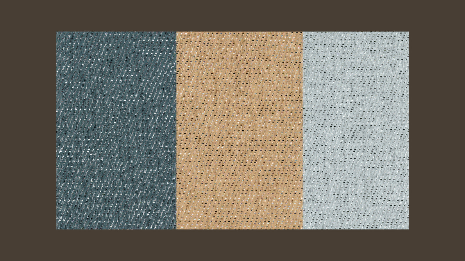
Attached are three floors from the upcoming collection. These three products are named Library, Honey and Spearmint - what is your immediate reaction, feeling, thoughts about them?

It’s a nice spread! I´m immediately drawn to the honey, warm, nourishing with a golden touch. I can see myself using it in many different contexts and rooms. Library is a great name for that colour. I can feel its calm, cooling and a reliable ground for any intellectual space. Spearmint looks airy and light, a good neutral.


Related stories